High Data-density Charts
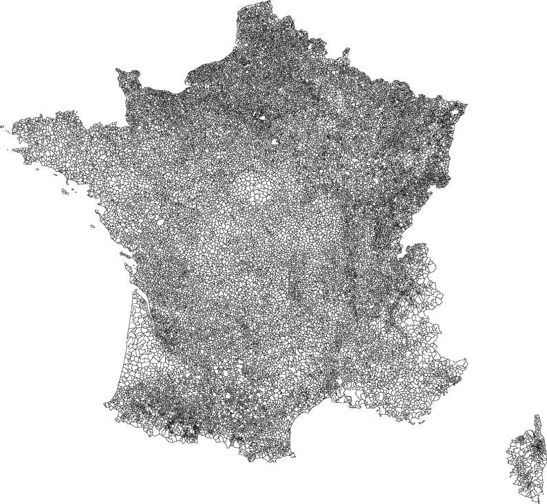
Communes de France
We often think that graphics should be understood at first glance, probably because we all suffered slide avalanches; In these situations, the time that is left for us to understand and assimilate a chart is counted in seconds … But there are also charts that we can, we must, take time to look at. These are the so-called High Data-density Charts popularized by Edward R. Tufte. He gives as an example the map of the 36,000 communes of France and calculated that at least 240,000 numbers are necessary to draw it. A well-made graphic, here a map, allows displaying this mass of information on a small sheet of paper, or 17,000 numbers per square centimeter! With such a graph we can make use of the wonderful ability of our eye to discern a large capacity of information in a small space. Look carefully, at length, this map and you will be amazed by the amount of information on the history and geography of France it displays. At Ekipaj, health data that we analyze for a single study range from tens of thousands to hundreds of millions. Creating original High Data-density Charts we seek to leverage the wealth of data, which is in the diversity of backgrounds and situations and that we can’t capture in a few simplifying pies.

